Redesigning how employees find information on a new intranet
And how using stakeholders as test participants can win their support.
Best Buy Canada, 2021
Company Intranets are rarely fun. They’re usually stiff, dated and only visited when employees have to go there. Best Buy's Intranet was no different. While working on the redesign, I found myself proposing a new way to organise the site, and having to win over worried stakeholders.

An abstract illustration of a disorganised site map in shambles.
The Problem. Best Buy’s Intranet had a lot working against it: it had a terrible name, ETK (meaning Employee Tool Kit) and it looked like a poorly planned Sharepoint site that was hit in the face. Luckily, all of that would be solved with new branding and a new platform to run on. What I had to solve for was foundational: How is content going to be organised? What was going to be the information architecture for the new site?
The old Intranet was organised by department. Needed to learn more about your vacation day policy? Human Resources. Looking for help with your computer? Information Technology. Need something translated into French? Translation Management. But organisational structures change, as do the functions of a team or department. So pretty soon the Intranet gets out of date and people can’t find what they’re looking for.
The alternative way (and better suited for an Intranet) is to organise the content based on the task a user is trying to complete. After all, everyone goes to an Intranet on a mission. It was a dramatic change to the old way. The real problem I faced was convincing senior stakeholders that this wasn’t going to piss off everyone in the company, and to convince the team that was going to own the content platform that this was going to be better than what they were used to.
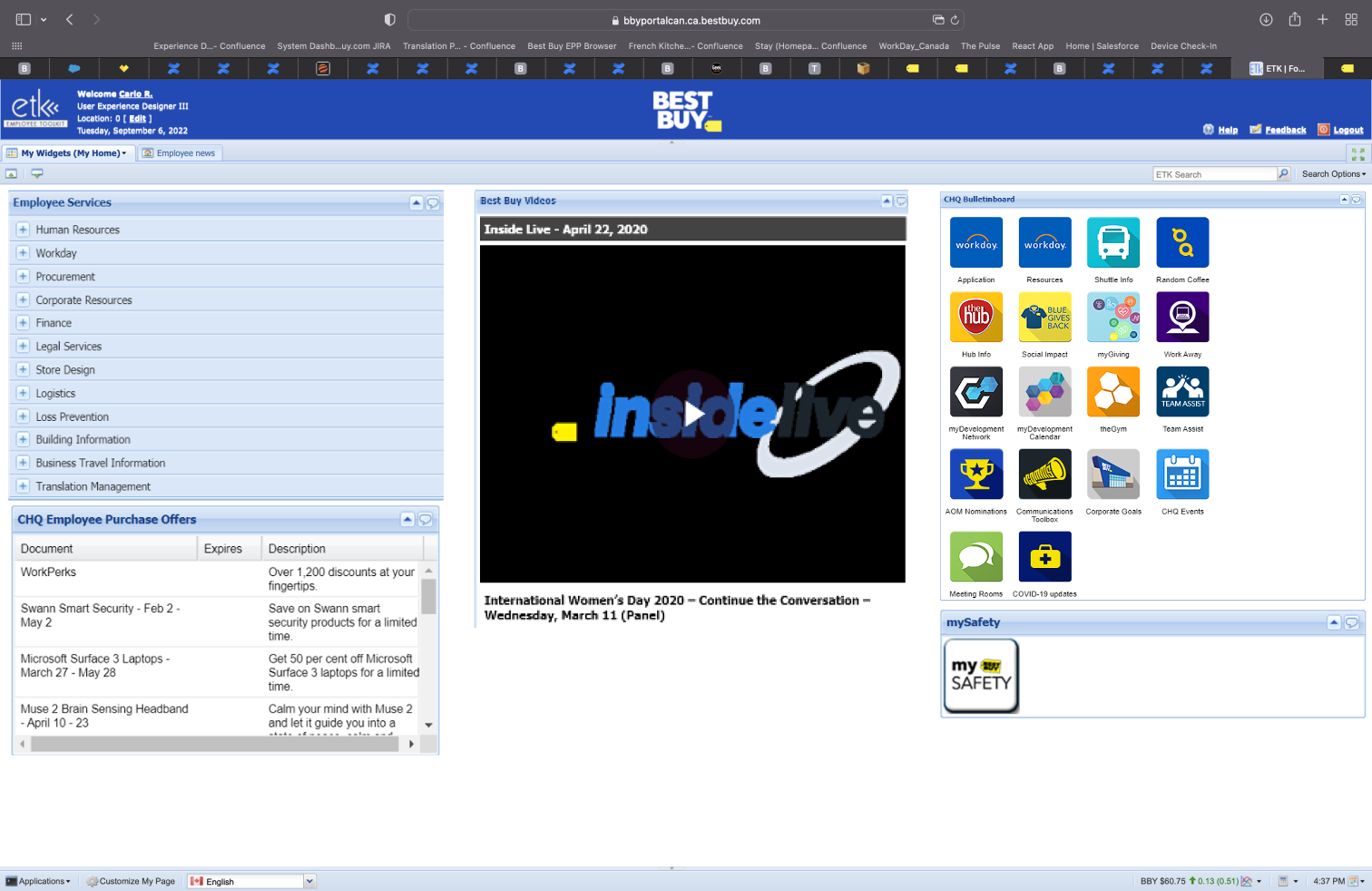
Employee Tool Kit (ETK), the homepage to Best Buy’s Intranet up until 2021.
The Approach. In designing the information architecture, I performed a content audit of the old site, and worked with each content owner to have each block of information classified as either “move”, “update” or “delete”. This way we knew the information going into the new site was going to be reasonably relevant, and I got an idea of the type of content we held. I lead product owners through a card sort activity, to understand their mental model, and we put together a list of tasks to test employees with.
Employees as test participants can be hit or miss; sometimes they know too much about the thing you’re testing, which can warp the results with their biases. In this instance, they were perfect, because they’d be using the Intranet themselves. The test was simple: Give the participant a task (“You and your partner are expecting a baby. Where would you go to find the company policy about maternity leave?”), let them choose where they would find the information they need to complete the task, and note down if they’re correct.
I sent this test out to volunteer employees, but I also sent it to the executive stakeholder and their team. Some of them wanted to be involved, and I welcomed it. The results validated some hypotheses and revealed where improvements can be made. I updated the information architecture and did another round of testing, to land at the proposed design.
The template used to capture and audit the content of the old Intranet. I understood the content and what was going to be kept.
A simplified diagram of how content was first grouped by employees, as a result of a workshop I facilitated.
Results of a tree test performed on the proposed content structure. The results highlighted data that could be recategorised to better help employees find the information they need, such as some ambiguity around where to find upcoming events, and how to find a staff discount price.

The Pulse, the new homepage to Best Buy’s Intranet, with the established information architecture.
The Outcome. It was SO much easier to present the proposed design to the stakeholders, because they were actual test participants. They were familiar with the design, they saw the design improve from the first IA to the second, and they felt like they had the opportunity to provide input. And backed by a methodical approach of testing and iterating, I was able to demonstrate the improvements before a lick of code had been written.
So my takeaway is this: Be strategic in using your stakeholders as test participants. Testing designs and prototypes with stakeholders is a double-edged sword. They don’t represent the customer, so be mindful to separate their data point from the rest of the herd. They bring in their own biases and perspectives that come from a private jet looking down. On the other hand, their involvement can only help to get their support, because they’ve been given a closer look into the experience and they feel included.
And hey, if the experience doesn’t piss off the entire company, then I guess everybody wins.
◼️